Monday, 12 December 2016
FINAL DRAFT: FRONT COVER
I compared my previous design against magazine front covers I have analysed previously on my blog to help alter my own design. I was unhappy with it's general unprofessional appearance which I couldn't quite place what was causing it, and realised it was very likely the fonts. Sure enough, by using only 2 different fronts and alternating them, and also by sticking to a nice contrast of text colour, I have been able to tie my front cover together well.
Friday, 9 December 2016
Second Draft: Double Page Spread Following Feedback
After receiving some feedback for my first DPS draft, I realised the flaws in the first design. A DPS needs to really be devoted to the subject, and with such a large amount of space, it should allow large images.
This is just a quick mock-up of my possible future DPS - having 3 columns as opposed to two allows it to look more professionally laid out, and it's not so text-book format.
Big headers are needed, and it must be eye-catching. This still needs a lot of work, but this is the process I'm going through so it's worth blogging!
Thursday, 8 December 2016
First Draft: Contents Page
This is my first draft of my contents page which very closely follows my flatplan designs. I'm happy with this design - colourful, minimal.
First Draft: Double Page Spread
This is my first draft of my DPS. Overall I'm happy with the design, it's very traditional and looks clear. However, I'm conscious of the white background. I think I'd like to play around with that and find an alternative that still allows the text to stand out - though I realise this may be difficult.
Tuesday, 6 December 2016
Second Front: Cover Draft
Second Draft
Following my peer feedback from my initial draft, I've been working on improving that draft into something more suitable, and something I'm happier to show.
- I've changed the header font into something bolder and bigger so it's more of an eye-catching part of the design. I found the last font to almost blend in with the background which isn't what I want.
- I also edited the size of the cover lines, and reduced the amount I had on there. This creates a more minimalist feel which I think suits the overall look and allows the cover to say more about itself without text dictating it.
- I also decided to move my model so she was more on the right hand side of the cover. While this was a bit of a tricky procedure as I had to add more onto the image as the photo wasn't large enough, I did eventually get there. I moved the cover lines to the left hand side to add more balance to the cover.
Still needs some work but this is where I'm up to for the time being!
Tuesday, 29 November 2016
First Draft: Front Cover and Peer Review
This is my first draft for my magazine front cover.
I asked a number of people to check out this design and give me some feedback to 4 questions I asked so I could have some constructive criticism to help me make adjustments. For this draft I tried to follow one of my mock-up plans as closely as possible as I was happy with the outcome of that. I'm not sure about the turnout of this design though.
In conclusion, my feedback is positive, which helps me to know I'm on the right track. However some improvements that have been suggested include adjusting the cover lines - make them stand out more, and/or adjust the positioning. Another suggestion was making my header bolder - this is true as it's something I'd want to stand out if it was on the shelves in a shop, I personally think adjusting the font would be something to think about too.
Thursday, 24 November 2016
Tuesday, 22 November 2016
Edited DPS Images
Here is my collection of images that I've edited for my double page spread that will be in my magazine. Like in the post before, these images may not be the final edit when I come to use it, but I will probably only choose one of these images listed.
To view full selection, click on the image for the album to be opened in Flickr.

To view full selection, click on the image for the album to be opened in Flickr.
Edited Front Cover Images
Here is a slideshow of my edited images I'm considering for my front cover. These might not be the finished result but will likely be the only images I take into consideration for the construction of my front cover.
To view all the images in full, just click below and it should open up to my album on Flickr.

Double Page Spread Photoshoot #2
Okay, so after having a good look through my last photoshoot, I decided that the images with Ernie really didn't match the professionalism of my front cover photoshoot. I didn't want images that could be seen as offensive, though at the time I thought they could work as they make a statement about the artist/Ernie. I don't want to drive
Unfortunately, me and Ernie don't have much spare time where there's light, so I asked my friend Ed if he'd be willing to model for me, and he agreed.
Myself, Ed, and Ed's friend Ben all ventured out around Norwich to gain professional looking portraits of Ed that I can use on my DPS, and thankfully, Ed is quite the natural poser so the images come out pretty well thanks to him being comfortable! Despite it being very cold, and raining on and off, the outcome of this photoshoot was definitely successful - nice colour schemes, good representation of model, and good quality photos.


Sunday, 20 November 2016
Double Page Spread Photoshoot
So, I had planned with my friend Ernie, that today we'd take some DPS images. It came to 3 o'clock and he messaged me to let me know he couldn't meet me till 5pm. Unfortunately, there wasn't much I could do about that, and so we did meet at around 5.30, though it was dark by this point. I had originally planned for some well-lit, serious images, but with personality - mirroring the front cover photoshoot really. However, with the darkness, and my lack-of-a-tripod, I didn't have much luck in achieving those. The images I took haven't quite come out as well as I'd hoped, and with the flash I'm not a fan of the cheap lighting it brings. Though, nonetheless, it's a start! I'll see how I get on with these for the time being, but I'll take some new ones otherwise.

Saturday, 19 November 2016
Front Cover Photoshoot
I organised my photoshoot to be done today, with my good friend Georgie modelling. Despite the freezing weather, I did manage to get over 280 photos taken - but of course with not all of them being magazine-condition I have cancelled them down into 20 images in each of the 3 sessions.


Photoshoot 1:

These images were the first images we took. For this shoot I wanted to try out a natural look, so we used minimum makeup, plain background, minimalistic clothes. I wanted this so the images could look professional and real; I was to put these in black and white but as this is just a contact sheet I thought I'd put in the images before I edited them so you could see the general look I went for.
Photoshoot 2:

This was my second photoshoot. In this I asked Georgie to add some of her personality to her style, so she put on bold shimmery red eyeshadows and a more styled top. For these images, Georgie was more at ease and comfortable in front of the camera so these images came out more natural which is appealing to see. I did alternate between the white, and the blue background, but I found the white background to go best.
Photoshoot 3:

These photos were my final shot at getting a photo that really stood out to me. I used a white eyeliner to draw lines onto Georgie's face in an abstract form. I thought this could be something that would stand out more as a portrait. Georgie was happy to go for a serious look in these images which I think suited the general appearance more, making it look more edgy. I also thought the blue background helped the white markings to stand out more.
Tuesday, 15 November 2016
Pre-Production Work: Double Page Spread Flatplans
Just a brief draft on double page spread layout ideas. Completely aware that my colours on the first dsign in particular aren't ideal as they're difficult to read, especially with small text. The second design is one I prefer, but it's also one that's less informative with less text. I tried many different colours for the font of the text on the second design but none seemed to work as well as black - and even black doesn't work that well! Trial and error.
kxrsty on Scribd
Monday, 14 November 2016
Pre-Production Work: Contents Page Flatplans
These flatplan designs were just so I could experiment with how I'll organise my contents on the page. I think the second design looks much more professional than the first one with the fonts and general layout. This shows how important a variety of fonts is!
I want my contents page to be clear and simple and I think these designs are almost at that point. I recognise that there's perhaps too much empty space, and that something else needs to be incorporated. In summary, these have helped me to think about designs for my construction.
The images used are stock images from Google.
Saturday, 12 November 2016
Pre-Production Work: Front Cover Flatplans
These flatplans for my front cover were produced on InDesign to give myself an idea of what sort of layout I'd like to aim for in my construction of the magazine. All designs were made using stock images from the search engine Google.
While creating my flatplans, I decided I'd use a little slogan under the header to add a little something else to my magazine. I'm hoping 'Bringing new music to the blind ears' will help to show that my magazine has a primary focus on indie music - something that's different and not the generic stuff your ears become deaf to while it's playing through the radio all the time.
Cover #1 has, what I believe, a clear layout. I made a conscious decision to keep colour at a minimum by using a black and white stock image, and white and blue writing. This colour layout seems to go well together, but does give the magazine a cold appearance - though this could be interpreted as mature and professional.
Cover #2 I decided to make it minimalistic, with very little text. I quite like the general idea, but I think there's perhaps not enough empty space, or maybe too much. I'm really not a fan on the header font at all. It looked like it would work well as seen in my previous post of exploring fonts, but on this it looks more like it belongs on a magazine promoting joining the army.
I'm a fan on the colour scheme however, and also the general quirky appearance of the model.
I'm a fan on the colour scheme however, and also the general quirky appearance of the model.
Cover #3 is something I'm particularly drawn towards. This cover pulls of minimalistic better than the previous attempt I think, and there's still the general quirky appearance through the makeup and props. I'm not completely sure if this cover would be okay to use for a music magazine however as the front cover doesn't make you think of music - but the header, and text all point to a music magazine. I'll have to think this one over.
Tuesday, 8 November 2016
Press Release
VMagazine are investing in the publication and print of Liberated Sounds in January, 2017. Sold at £3, Liberated Sounds is a magazine with fresh artists and aesthetic qualities to bring new music to the ears of the young and hip. Featuring an unpredictable range of music artists: those new on the scene and those still raging on, the magazine will be a bestseller for the young with a true passion in music and culture. The magazine will be published fortnightly to the highs and lows of Britain's regions.
Young people aged between 17 and 25, of all backgrounds, will be grabbing these high in demand 10,000 copies every release from off the shelves. Liberated Sounds, a visually driven magazine, aspires to inspire the young to aim for beyond the unknown. We believe in breaking conventions and creating individualism through music for everyone to be comfortable in their own skins. The magazine aims to be informative on new artists, new approaches to music, new reviews, new releases - new, new, new. Modern is the key, and modern is the outlook.
Young people aged between 17 and 25, of all backgrounds, will be grabbing these high in demand 10,000 copies every release from off the shelves. Liberated Sounds, a visually driven magazine, aspires to inspire the young to aim for beyond the unknown. We believe in breaking conventions and creating individualism through music for everyone to be comfortable in their own skins. The magazine aims to be informative on new artists, new approaches to music, new reviews, new releases - new, new, new. Modern is the key, and modern is the outlook.
Pre-Production Work: Final Magazine Name
NAMES FOR MAGAZINE
Small Sounds
Unsung Music
Unsung Artists
Different
Free-Spirit Songs
Wild&Free
Liberated Beats
Liberated Sound
Indie&Wild
Dependant on
Different
Indie&Diff
Liberated Melody
The words highlighted are potential names that stand out to
me. In particular, I like the use of the word ‘liberated’ as it shows the free
movement and lack of conventions for indie music. Liberated Beats is a name
that I’m drawn to but the use of the word ‘beats’ would be used for a different
genre, such as grime or hip-hop. Therefore, I want a softer word that would
suit ‘Indie’ more; I think this would be something such as sound.
My magazine will be named: Liberated Sounds
Friday, 4 November 2016
Pre-Production Work: Masthead Designs
There are a few tests of fonts for my masthead of my magazine. I like all these fonts as they're modern and easy to read; the font is a very important factor of the magazine as it must be easy to read to bring in an audience, but it must also be appropriate. I think all of these would be appropriate, perhaps 'Handwriting Draft' in particular as it portrays the development of indie music as a whole. It will never be a set genre, but always something moving forward and constantly being influenced by other factors.
Pre-Production Work: Interview and Artists
Interview for Double Page Spread
For my interview, I will need to be interviewing an artist that will attract an audience, so therefore it will need to be an artist that is well known in the indie genre. By looking at my questionnaire analysis, the well-known artists would be a good place to start.
I'd like to focus on modern, on-scene artists, so this could be artists such as Bastille or Foals. Both these artists are well-known amongst the younger audience that I'd ideally like to attract.
Potential Questions for Interview:
- How did you start your musical career?
- Were you musical as a child?
- What artists have you been inspired by?
- What's been your favourite performance in the past year?
- Do you get nervous before performances?
- Have you ever had an embarrassing moment while performing?
- Where do you seen yourself in future?
- How do you deal with fans in public?
- Has life changed for you since you became more widely known?
- What do you find most interesting/fun in your career?
- What else do you do outside of music?
- How do you spend your time at home?
- What music festivals have you been to/where do you recommend?
- Do you like to party?
- What advice do you have for your fans?
My interview can be in two different forms: serious and informative, or light hearted. I think for my magazine, a more light-hearted approach should be used, but it should also be equally informative so that the reader's have their money's worth.
Tuesday, 1 November 2016
Monday, 31 October 2016
Deisgn Inspiration
Visual Audience Profile
I created this through the data I found through my questionnaire.
My audience are young adults in Britain, all with an interest in indie music. I found that many of those who filled out my questionnaire enjoy reading, playing instruments, and also shop for clothes at places such as Primark, H&M, and Topshop/Topman.
Friday, 28 October 2016

Questionnaire - Audience Research
This is the questionnaire that I supplied through social networking to get the public to fill in.
Saturday, 22 October 2016
Magazine Analysis: 'INDIE' - Music and Fashion
Front Cover Analysis of Indie
 This magazine generally has the front covers in washed out shades that create drama in the image. The colours used are pastel shades, or generally black and white with a splash of colour in places. After some research I found that in the summer editions the colours are generally brighter and bolder which shows that they take season into account when designing their front cover.
In terms of design, the front covers have a main subject of a person, who is generally surrounded by negative space; this creates a minimalist style. The masthead of the magazine consists of large, bold sans-serif text in white. This is the same on every issue so that they remain to keep the same recognisable name. The cover also has very minimal text. Besides the masthead, it has a barcode and just a few words in the bottom right corner.
Here is a collection of front cover issues of the magazine Indie, an international music and fashion magazine which is released seasonally. I have decided to analyse these in bulk so that I would be able to show you this magazine's general style.
 This magazine generally has the front covers in washed out shades that create drama in the image. The colours used are pastel shades, or generally black and white with a splash of colour in places. After some research I found that in the summer editions the colours are generally brighter and bolder which shows that they take season into account when designing their front cover.
In terms of design, the front covers have a main subject of a person, who is generally surrounded by negative space; this creates a minimalist style. The masthead of the magazine consists of large, bold sans-serif text in white. This is the same on every issue so that they remain to keep the same recognisable name. The cover also has very minimal text. Besides the masthead, it has a barcode and just a few words in the bottom right corner.
The models on the front covers all have a unique style which goes against general conventions in style, for example a male with 'feminine' qualities such as long hair or a feminine face. Most men features on magazines would hold the typical image of a masculine male with rugged looks, and a beard. The woman on these magazines also contrast against other magazines as the women on these magazines have an edgy appearance with sharp features, bold makeup, or random objects featured with their image. Each model has a serious facial expression which shows the magazine is official, and something to be taken seriously. These models used are obviously to represent the generic 'indie' styled person who naturally goes against the trends in general style and music. This no doubt will attract an audience who relate with this rebellious personality, or those who feel this is the way to become their own person.
Overall, I think this is a daring way to design a magazine. The front covers hold almost no information on them, and show nothing of the inside contents except a hint that the model on the front cover will likely be featured. In my opinion, this magazine relies entirely on the curiosity of potential readers who want to see what's inside the mysterious magazine. It does well to represent people of similar style who want to be different. The magazine itself is quite a beautiful design and inspirational in that way. The magazine clearly targets a young-adult audience of ages 16 to late 20s who of which identify themselves to be 'different'. Older audiences are unlikely to find interest in this magazine as the indie movement is something amongst the younger generation.
'INDIE' is a magazine published in both German and English by Plastic Media who are based in Vienna. Roughly 55,000 copies are printed and sold every 4 months, but download copies are available. Plastic Media also publish a magazine called Material Girl which solely focuses on fashion and style.
Autumn Issue 2016

This is the magazine I managed to purchase (in German) online. This is the Autumn 2016 edition, which is a Japan issue - and is expressed through the red themed colour choices on the front cover. Each issue alternates between different countries so that it expands peoples' culture and knowledge.
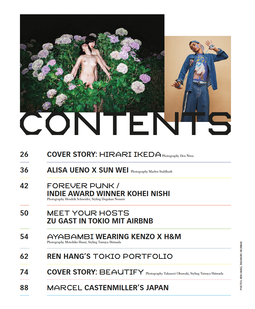
This is part one and two of the contents pages. In page one, we can see here that it has a very clear layout and with colours that slightly clash. For example, in the image on the left it's mainly green, whereas the image on the right is beige and blue. This could be showing typical conventions of Japanese style, or the magazine may just be expressing its non-conventional style.
 'Contents' on both pages is in a clear, bold font and stands out well against the white background. The fonts in general on the contents pages both alternate, keeping the pages engaging, and the colourful line separating each of the subheadings allows everything to remain neat and easy to read.
Like seen in previous magazine analyses, this magazine has also used very brief and ambiguous headings under contents to draw in the readers; they don't even include a hook to allow the curiosity to peak. They have very minimal writing which adds to their layout.
In the contents pages, we're immediately greeted with striking images that may be looked upon as unflaterry or immoral, as they have strange expressions, and unusual clothing - or no clothing. I imagine they've done this as it's not something you see in generic fashion and music magazines, such as Q, or Elle; this approach stands them out from other magazines. The first image of the two woman standing amoungst carnations strikes me as quite a meaningful image as carnations are known to express admiration, but they're also featured in the Bible when Virgin Mary's tears fell to the floor and they grew in placement. This could be an image that's expressing motherhood, or love.
In summary, I think this is a simple and effective contents page. They are meant to be informative pages that help readers find what they're looking for, and I think this is a good example of exactly that.
Thursday, 20 October 2016
Magazine Analysis: 'Uncut' - Music
Music magazine analysis from Kirsty Hamilton-Emery
This analysis of the magazine 'Uncut' is a good lead in my research. The only problem is that this magazine is the genre of rock, whereas I'd like to focus on a genre of indie music. I've struggled to find any indie based magazines in any shops and so have had to make the best out of the options I have.
Although this isn't the genre I would like to follow, it allows me to see the general layout of a music based magazine and give me ideas in how I should design my layout in the future.
Tuesday, 18 October 2016
Genre Research of my Magazine
This is a scan of some notes I made to choose what my music magazine would focus on genre-wise. I thought the easiest way to go about this would be by choosing music I'm personally interested in so that I'll feel more involved in my work and will have more context without having to do a wide-spread of research.


I wrote down some artists I have in my playlists and researched the genre. The over-ruling genre I listen to seems to be indie/ indie rock so by having the broad genre of indie music I can include a wide range of artists in this, covering indie rock, indie pop, and so on.
Thursday, 13 October 2016
Magazine Analysis: Front Cover and Contents Page - Fashion
Front Cover Analysis of Vogue
 A range of fonts are used in this front cover so that each text stands out by contrasting against each-other. It's important that the front cover is the most eye-catching part of the magazine in order to attract attention to itself. Serif - a mature font - is used in the title and a couple of cover lines; the header is always in this font for each of the magazines so that the magazine is easily distinguishable and maintains its appearance. Other sans-serif fonts used are bolder, others are in italics.
The image on the front cover is of Georgia May Jaggers, a British model. This model has an eye-catching flawless natural beauty: minimal makeup, soft pink lips, natural tousled hair, clear and smooth skin. She has a typical girl-next-door appearance which is what many people aspire to look like. She has a direct gaze and her green eyes are complemented against the background of the portrait and the denim jacket she's wearing. She has a well-known reputation of modelling for the denim clothing brand Hudson Jeans - the style choice in the cover also relates to the spring fashion that is revealed in the magazine.
Vogue is available to buy copies in print, and also to download as an e-magazine. Condé Nast Publications is the publisher that distributes Vogue. This company is an American mass media establishment who are responsible for many other magazines such as Glamour, Wired, The World of Interiors. The large range of magazines they publish are aimed at a large variety of different audiences which allows the publisher to make money out of many different people.
While this magazine's content doesn't directly apply to my music magazine development, it does help my research in magazine structure and professional image. My analysis has helped me to see the different language uses I can use to draw in an audience, and how to target a specific audience with just the cover.
Contents Page Analysis of V Magazine
This is the contents page to another fashion magazine named 'V'. Again, I am fully aware that I'll be producing a music magazine, but the beauty of fashion magazines is something I'm keen to include in my work. This issue was published in October 2008. V Magazine was launched in 1999, and releases a copy 4 times a year, for each season's fashion.

This design has a clear focus on the model of the image. She's the only person featured on the contents page, and the general colour scheme is set out to compliment her, for example using clear black and white writing, and grey background with a vignette to help the logo and header stand out. The model is also making direct address, and takes up at least half the page. She's wearing minimal clothing and her pose can be seen as seductive, and glamorous. Women looking 'sexy' is very conventional in the media, but it does help to promote fashion if the model is considered beautiful.
The font used for 'contents' is in bold, and clear writing so that the page stands out and is easy to distinguish, against the other pages. The writing for the sub-headings are in a fancy style with in a serif font. This can be seen to reflect the elegant and classy fashion within the magazine. Then the writing about the contents is in a clear font so it's easy to work out what is where.
The titles of the pages we can see featured on this page are short and quite ambiguous. For example, 'Barely There'. This could be referring to almost anything, but as we know that this is a fashion magazine, the connotations of 'barely there' are quite sexual in the way that there would be minimal clothing. This is likely to be what the main image on the contents page is referring to so that it draws the readers in.
Fashion is generally considered to be a 'girly' subject, and this magazine does seem to be one that targets itself at a trendy, young women audience. I am aware that this company produces a magazine called 'VMan' which is a fashion magazine aimed specifically at men.
In summary of these two short analyses, I can see that in fashion magazines they use a limited amount of colour, which tie each of the pages together by doing so. I think that it's important for magazines to be aesthetically pleasing in order to look professional, and I'm personally drawn towards these minimalistic layouts that keeps everything clear and organised.
Saturday, 8 October 2016
Critical Analysis of College Magazine
This is my analysis of my front cover and contents page I designed.
If this post won't load properly, I recommend changing the browser. Sorry for an inconvenience.
Front Cover and Contents Page with Peer Feedback
Front Cover:
My front cover ended up following my flat-plan design well, and also my general expectations. Some possible improvements I was suggested by my peers included enlarging the text to decrease the large amounts of free space; adding a barcode; adding shadows to texts to aid in readability.Contents Page:
I'm pleased with the end result of my contents page. I received good feedback but a couple suggested improvements were adding something else to reduce the white space on the page, and also using a wider variety of fonts.
Thursday, 6 October 2016
Flatplan Designs: Front Cover and Contents Page
Front Cover Flatplan Design
Contents Page Flatplan Design
These two above documents are my flatplan designs for my front cover and contents page. I labelled what each rectangle represented for a more detailed design. I chose these layouts with inspiration from looking at other successful magazine covers and contents page.
Visual Audience Profile
Visual Audience Profile by kxrsty on Scribd
My visual audience profile wasn't as easy to do as I had hoped due to the questions I asked in my questionnaire. Next time I will know to ask more personal questions in order to get more of an idea of my audience.I have based my audience profile on what I know my generation is generally like and what they enjoy doing.
Subscribe to:
Comments (Atom)