Front Cover Analysis of Indie
 This magazine generally has the front covers in washed out shades that create drama in the image. The colours used are pastel shades, or generally black and white with a splash of colour in places. After some research I found that in the summer editions the colours are generally brighter and bolder which shows that they take season into account when designing their front cover.
In terms of design, the front covers have a main subject of a person, who is generally surrounded by negative space; this creates a minimalist style. The masthead of the magazine consists of large, bold sans-serif text in white. This is the same on every issue so that they remain to keep the same recognisable name. The cover also has very minimal text. Besides the masthead, it has a barcode and just a few words in the bottom right corner.
Here is a collection of front cover issues of the magazine Indie, an international music and fashion magazine which is released seasonally. I have decided to analyse these in bulk so that I would be able to show you this magazine's general style.
 This magazine generally has the front covers in washed out shades that create drama in the image. The colours used are pastel shades, or generally black and white with a splash of colour in places. After some research I found that in the summer editions the colours are generally brighter and bolder which shows that they take season into account when designing their front cover.
In terms of design, the front covers have a main subject of a person, who is generally surrounded by negative space; this creates a minimalist style. The masthead of the magazine consists of large, bold sans-serif text in white. This is the same on every issue so that they remain to keep the same recognisable name. The cover also has very minimal text. Besides the masthead, it has a barcode and just a few words in the bottom right corner.
The models on the front covers all have a unique style which goes against general conventions in style, for example a male with 'feminine' qualities such as long hair or a feminine face. Most men features on magazines would hold the typical image of a masculine male with rugged looks, and a beard. The woman on these magazines also contrast against other magazines as the women on these magazines have an edgy appearance with sharp features, bold makeup, or random objects featured with their image. Each model has a serious facial expression which shows the magazine is official, and something to be taken seriously. These models used are obviously to represent the generic 'indie' styled person who naturally goes against the trends in general style and music. This no doubt will attract an audience who relate with this rebellious personality, or those who feel this is the way to become their own person.
Overall, I think this is a daring way to design a magazine. The front covers hold almost no information on them, and show nothing of the inside contents except a hint that the model on the front cover will likely be featured. In my opinion, this magazine relies entirely on the curiosity of potential readers who want to see what's inside the mysterious magazine. It does well to represent people of similar style who want to be different. The magazine itself is quite a beautiful design and inspirational in that way. The magazine clearly targets a young-adult audience of ages 16 to late 20s who of which identify themselves to be 'different'. Older audiences are unlikely to find interest in this magazine as the indie movement is something amongst the younger generation.
'INDIE' is a magazine published in both German and English by Plastic Media who are based in Vienna. Roughly 55,000 copies are printed and sold every 4 months, but download copies are available. Plastic Media also publish a magazine called Material Girl which solely focuses on fashion and style.
Autumn Issue 2016

This is the magazine I managed to purchase (in German) online. This is the Autumn 2016 edition, which is a Japan issue - and is expressed through the red themed colour choices on the front cover. Each issue alternates between different countries so that it expands peoples' culture and knowledge.
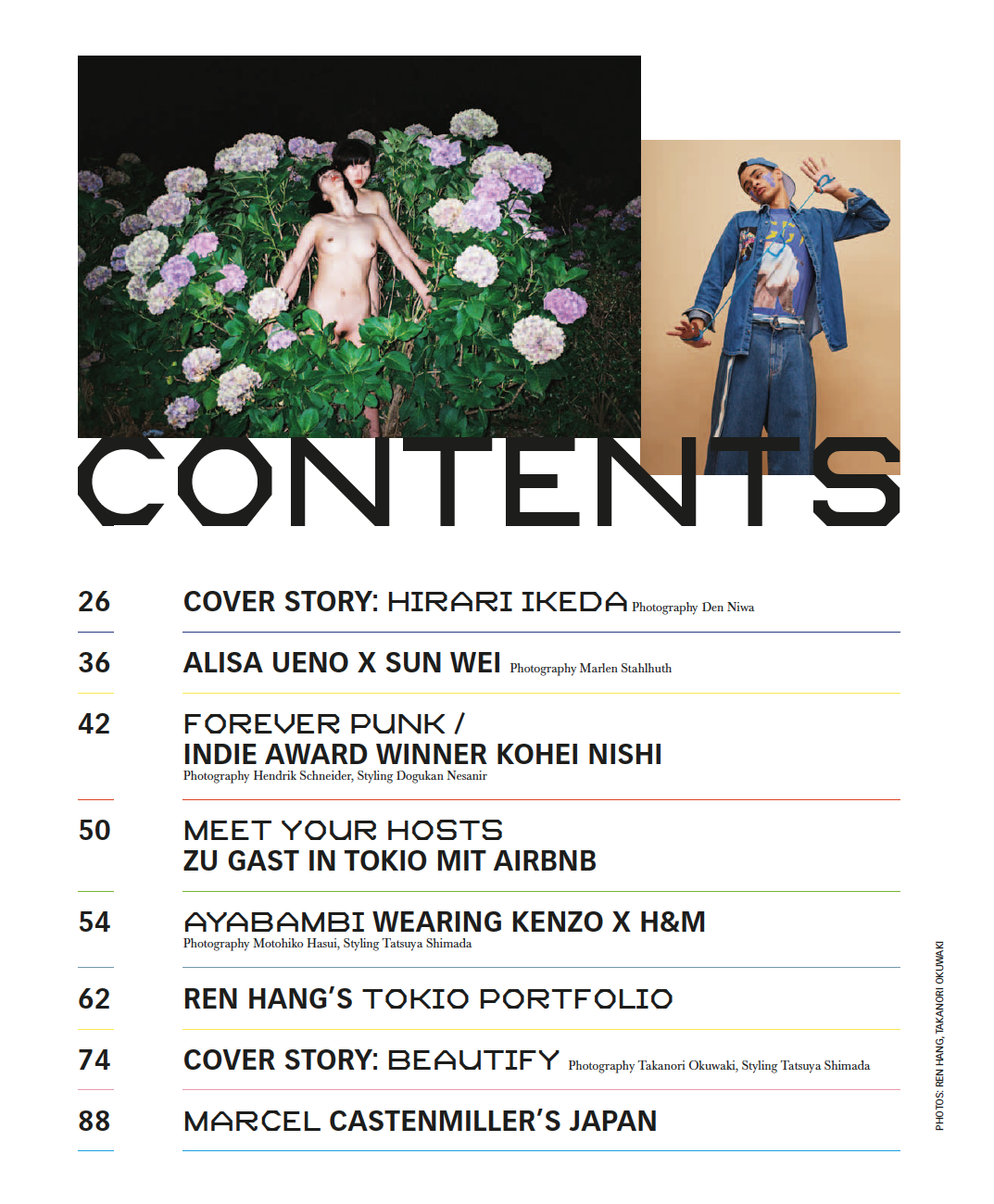
This is part one and two of the contents pages. In page one, we can see here that it has a very clear layout and with colours that slightly clash. For example, in the image on the left it's mainly green, whereas the image on the right is beige and blue. This could be showing typical conventions of Japanese style, or the magazine may just be expressing its non-conventional style.
 'Contents' on both pages is in a clear, bold font and stands out well against the white background. The fonts in general on the contents pages both alternate, keeping the pages engaging, and the colourful line separating each of the subheadings allows everything to remain neat and easy to read.
Like seen in previous magazine analyses, this magazine has also used very brief and ambiguous headings under contents to draw in the readers; they don't even include a hook to allow the curiosity to peak. They have very minimal writing which adds to their layout.
In the contents pages, we're immediately greeted with striking images that may be looked upon as unflaterry or immoral, as they have strange expressions, and unusual clothing - or no clothing. I imagine they've done this as it's not something you see in generic fashion and music magazines, such as Q, or Elle; this approach stands them out from other magazines. The first image of the two woman standing amoungst carnations strikes me as quite a meaningful image as carnations are known to express admiration, but they're also featured in the Bible when Virgin Mary's tears fell to the floor and they grew in placement. This could be an image that's expressing motherhood, or love.
In summary, I think this is a simple and effective contents page. They are meant to be informative pages that help readers find what they're looking for, and I think this is a good example of exactly that.
No comments:
Post a Comment